Brief
Using either your own family history or a fictitious one, create a family tree using a pedigree or genealogy chart.
Now use this family lineage to create a cartogram that plots where these family members were located.
Look at some examples online if you’re not familiar with any of these ways of presenting information.
Analysing the Brief
The brief is asking me to create a family tree using a genealogy chart and then present this as a cartogram to plot where family members are located.
Research questions
- What do genealogy charts look like
- What would a cartogram of this type look like
- How have contemporary graphic designers answered a similar brief
Research
This is an area I am definitely not familiar with so I thought I’d start by looking at examples of genealogy charts and cartograms. My mother in law is really interested in genealogy and has traced her family tree back to the Plantagenets. I borrowed a few books from her to get me started.


It’s really fascinating to see how far back you can trace your family tree. It’s helpful to see how the author/designer has presented the information.
Genealogy charts
I thought I’d collect some more examples, particularly looking at different ways designers have presented the data.


Image available at: https://www.scrapbookyourfamilytree.com/product/our-roots-pedigree-chart-8-x-8/ Accessed on: 1st April 2022
Image available at: https://www.shutterstock.com/image-illustration/pedigree-ancestry-chart-template-portraits-men-1470564128 Accessed on: 1st April 2022
Here are two of the first examples I found. The first goes into much more detail whereas the second is much more of a visual. I really like the more visual approach with imagery as it looks really engaging. It doesn’t really communicate enough information though.
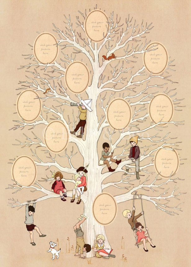
Image available at: https://belleandboo.com/products/family-tree-art-print?variant=36086537748638&gclid=CjwKCAjwrqqSBhBbEiwAlQeqGoBi6XDuchXnKfUMoC62PQDuR5yLqwCuIuH1f9_TiLvZe3LEVmEnkBoCDvgQAvD_BwE Accessed on: 1st April 2022
This is a really nice illustrative example that would look great on the wall. Perhaps not really a suitable style for this project though. I think the brief is asking for a simple, straightforward genealogy chart just to lay out the information; this information will then be used to create the cartogram. I think, design-wise I am being asked to create something quite functional as a means to focus the information I will need for the second part of the project.


Image available at: https://online.visual-paradigm.com/diagrams/templates/family-tree/multi-generation-family-tree-template/ Accessed on: 1st April 2022
Image available at: https://online.visual-paradigm.com/diagrams/templates/family-tree/family-tree-sample-blank/ Accessed on: 1st April 2022
These two examples are much more in-keeping with what the brief is asking for. They set out the information in a clear, easy to read way without any unnecessary design features or imagery. It is useful to see how this information can be presented as family trees are a new thing for me.
Cartograms
Maps and cartography are another area of design that I’m quite clueless about so I had a look at some examples.


Image available at: https://www.vox.com/2015/1/27/7918377/population-cartogram Accessed on: 1st April 2022
Image available at: https://vividmaps.com/tag/oil/ Accessed on: 2nd April 2022
I really like the bold use of colour to break down the information. The idea of using a GIF to present the information is also really interesting! I might try this if I have time.
Infographics
As I was researching I started thinking about what genealogy charts and cartography actually are and I concluded that they are types of infographic – a visual method of presenting information making it easy to understand, accessible and visually pleasing. With this in mind I decided to explore different types of infographic.


Image available at: https://venngage.com/blog/map-infographic/ Accessed on: 2nd April 2022
Image available at: https://www.pinterest.co.uk/pin/459859811944731893/ Accessed on: 2nd April 2022
Image available at: https://www.webdesignerdepot.com/2009/10/30-superb-examples-of-infographic-maps/ Accessed on: 2nd April 2022
I like how these examples use simple shapes and colour to direct the eye and present the information.
alexdndz
Image available at: https://dribbble.com/shots/14351831-Bankign-Mobile-App-Elements-Ui-Kit Accessed on: 2nd April 2022
I began exploring how other contemporary designers had answered a similar brief and I cam across a designer called alexdndz. I really like how they use bright pops of colour against a neutral background to really focus the eye on the information being presented.
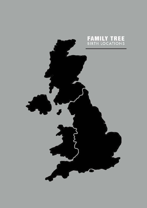
My family tree
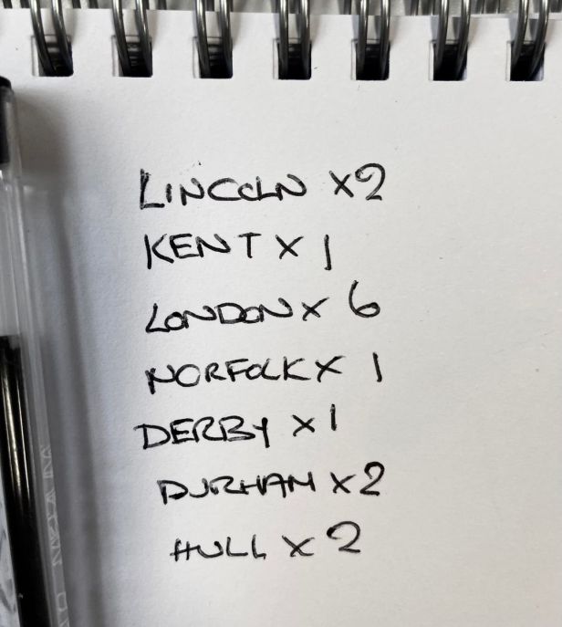
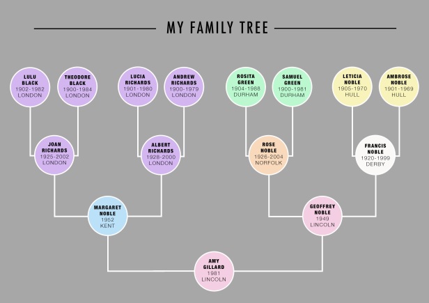
Before moving on to the idea generation stage I thought I’d gather my data together and put together a simple genealogy chart.
I mapped out my family tree as far back as I can and laid it out in a simple chart. I have included the location where each person was born to help me plot out my cartogram.
Idea generation
Armed with the information I gathered during my research, I decided to start sketching out and jotting down ideas in my sketchbook to generate some ideas.


I like the idea of using shapes at different scales to illustrate the number of family members born in each location. I think this is a good way of communicating the information clearly without relying too much on text. I also like the idea of incorporating names or the numbers of family-members into the map.
Which ideas to develop further?
I am really keen to develop the idea of using shapes or numbers at different scales to represent the number of family members in a particular location. I also like the more simple approach of listing the names of family members and using pins or arrows to indicate where in the country they were born – the only issue might be having the space to lay out all of the information. It might look a bit too cluttered.
Colour-coding also seems like the most logical approach to link information, i.e. a family member to the location.
I don’t think I’ll continue with the idea of including photographs of family members as this does not seem to really fit with the simplicity and ‘form follows function’ ethos of the project. It just doesn’t seem necessary to include photographs.
Developing ideas
Now that I have decided which ideas to proceed with I am going to explore them digitally to see what works and what doesn’t.
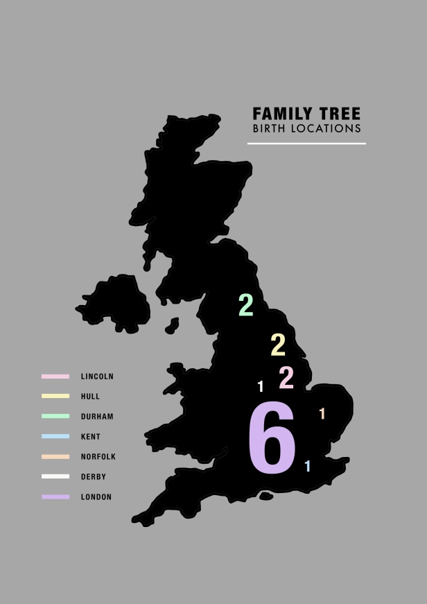
Idea 1: Scaled circles
I have scaled the circles to represent the number of family members in that location, i.e. the largest circle representing 6 people is 300%, the circles representing two people are 100% and the circles representing 1 person are 50%.
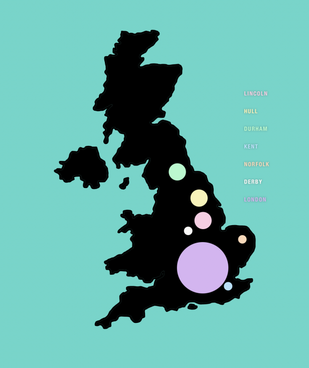
This is my first draft and there are definitely some things that don’t work. I don’t like the text as it doesn’t stand out against the turquoise background and it just doesn’t tie together.
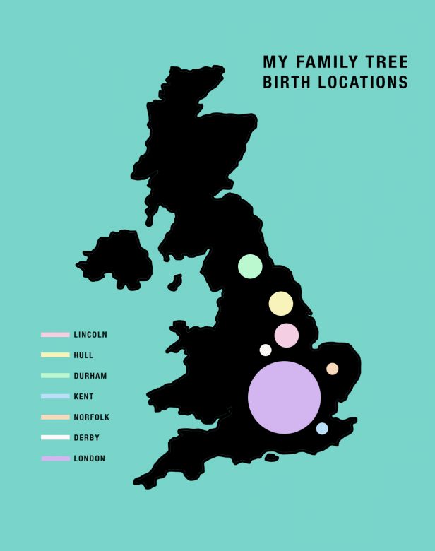
This composition looks more balanced and the black text pulls everything together better.
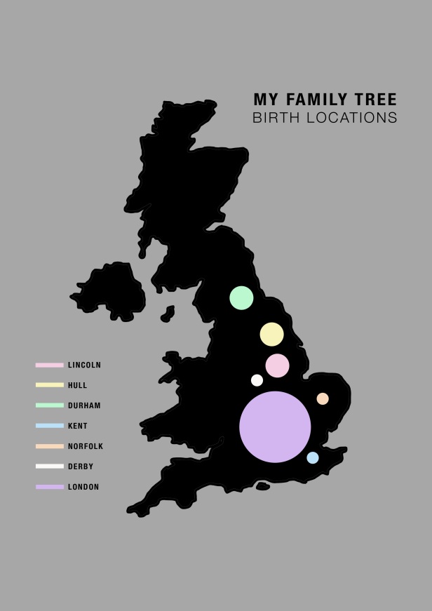
Having the background a more muted colour makes so much difference; it really makes the locations stand out more and the information easier to read.
I like how this looks visually but I’m not sure that it is very successful at communicating the information. It’s almost like I’ve got too far down the Occam’s razor route!
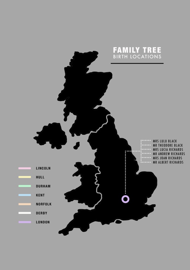
Idea 2: Numbers
My second idea was to have numbers pinned to the locations to show how many of my family members were born there.
I thought about trying to merge the number of family members with the family name but it looks too confusing.
I don’t think this idea really communicates the information effectively. If I were to glance at this without any prior knowledge of what it’s about, I would just feel confused. It’s difficult to relate the number to family members.
Idea 3: Names
I had this idea of actually listing the family names to relate the infographic more to the actual people rather than just using shapes and numbers which could mean anything.
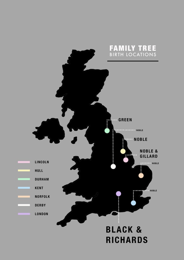
My aim here was to scale the names in terms of how many family members were in that particular locations – so the 6 London family members were represented in 28pt lettering, this was then halved and then have again. This idea doesn’t really work though as it looks too confusing.
My next idea was to list the names linked with each location. This is a straightforward way of presenting the information but it looks too text-heavy. I noticed looking at infographics during the research stage that they tend not to rely too much on text.
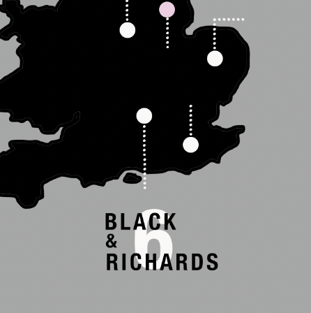
Idea 4: Faces/figures
My final idea was to represent family members with an emoji or symbol of a figure. This immediately links the number to actual humans making the information easier to understand.
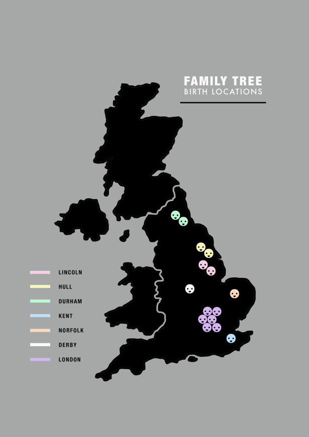 I am really happy with how this idea turned out. I think it communicates the information effectively whilst being engaging and interesting to look at.
The brief didn’t hint at any particular style preference or target audience so I think I will keep the colour palette, style and typefaces as they are. The typefaces I chose (Helvetica Neue Bold Condensed and Black Condensed and Futura Medium) are both very clear, simple and easy to read; I have noticed that effective infographics don’t usually use lots of fonts or particularly cursive or decorative type as it’s often distracting and hard to read.
I really like how the colour palette works. Changing the blue background to grey was a good choice as it makes the pastel colours which represent the information really pop; the eye can instantly link the colour-coded location and family members making the information quick and easy to understand.
Finished designs.
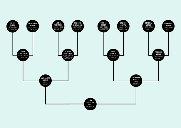
I went back and re-did the genealogy chart using the same typeface and colour palette. I really like how these turned out.
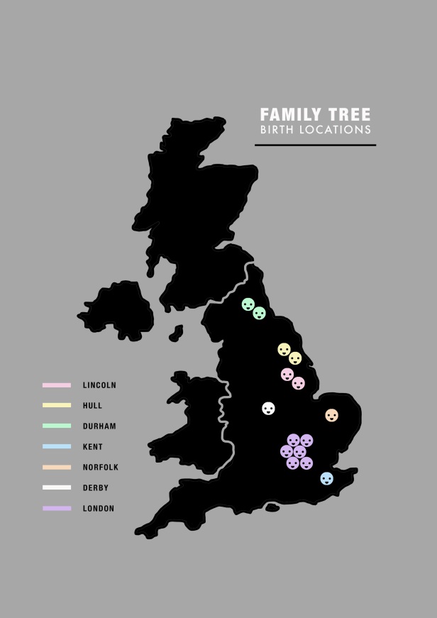
GIF
During my research I found a cartography GIF that I liked. Having a moving image as opposed to a static one can feel more interesting and engaging, plus it allows you to choose the order in which the viewer sees the information. Here is there GIF I made of my cartograph